


Packaging and branding for Odyssey Supplements, Ronkin Group LLC. 2018
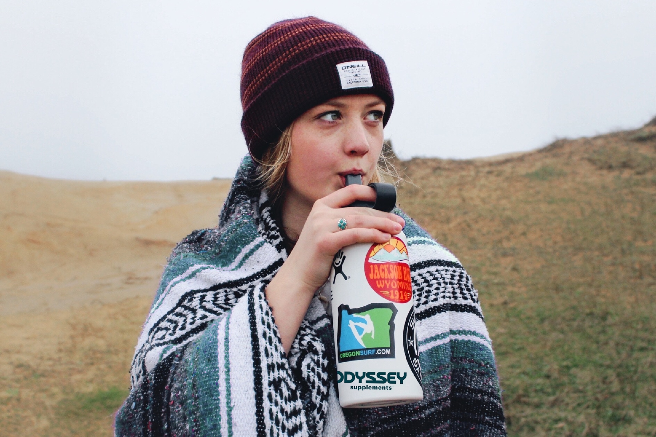
The Ronkin Group was seeking to develop an ownable brand identity for a new line of premium yet affordable all-natural supplements. Entering the marketplace with an eye-catching design and unconventional packaging structure that surpassed category norms was critical to appeal to younger consumers and differentiate from competitors.
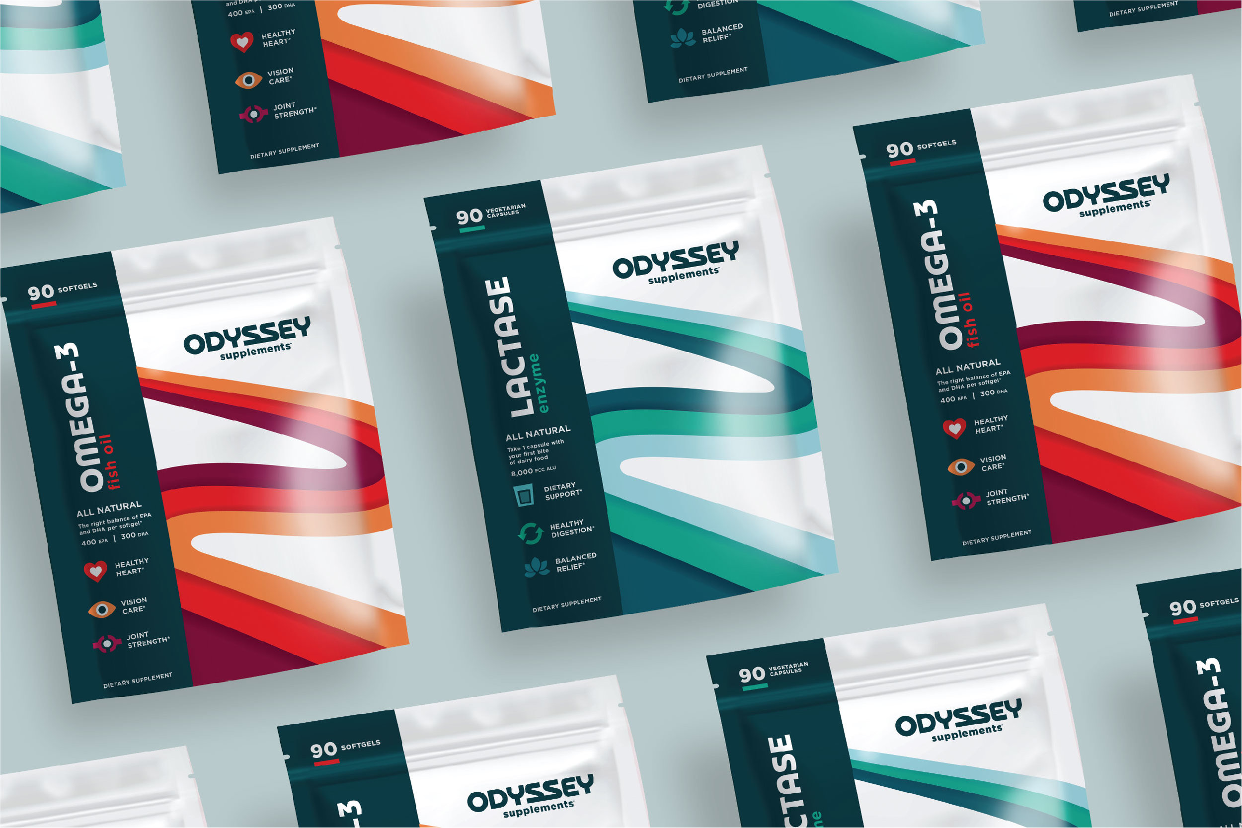
A range of brand names were developed as a first step to distinguish these all-natural supplements from those of competitors. Odyssey, meaning ‘a long and adventurous journey’, is visualized in a simplistic and approachable wordmark that conveys movement and progression.
Odyssey’s packaging structure creates a noticeable difference on shelf, stands out among bottled competitors, and also maximizes the usable space for branding. The abstract path symbolically represents one's journey towards lifelong wellness, while the color of the path changes for each supplement type for clear differentiation.
To help consumers understand the unique characteristics of each supplement, consumer-friendly copy and graphic icons emphasized the benefits in a visually impactful way. The icons also color-corresponded with the path graphic, making each supplement easily identifiable.
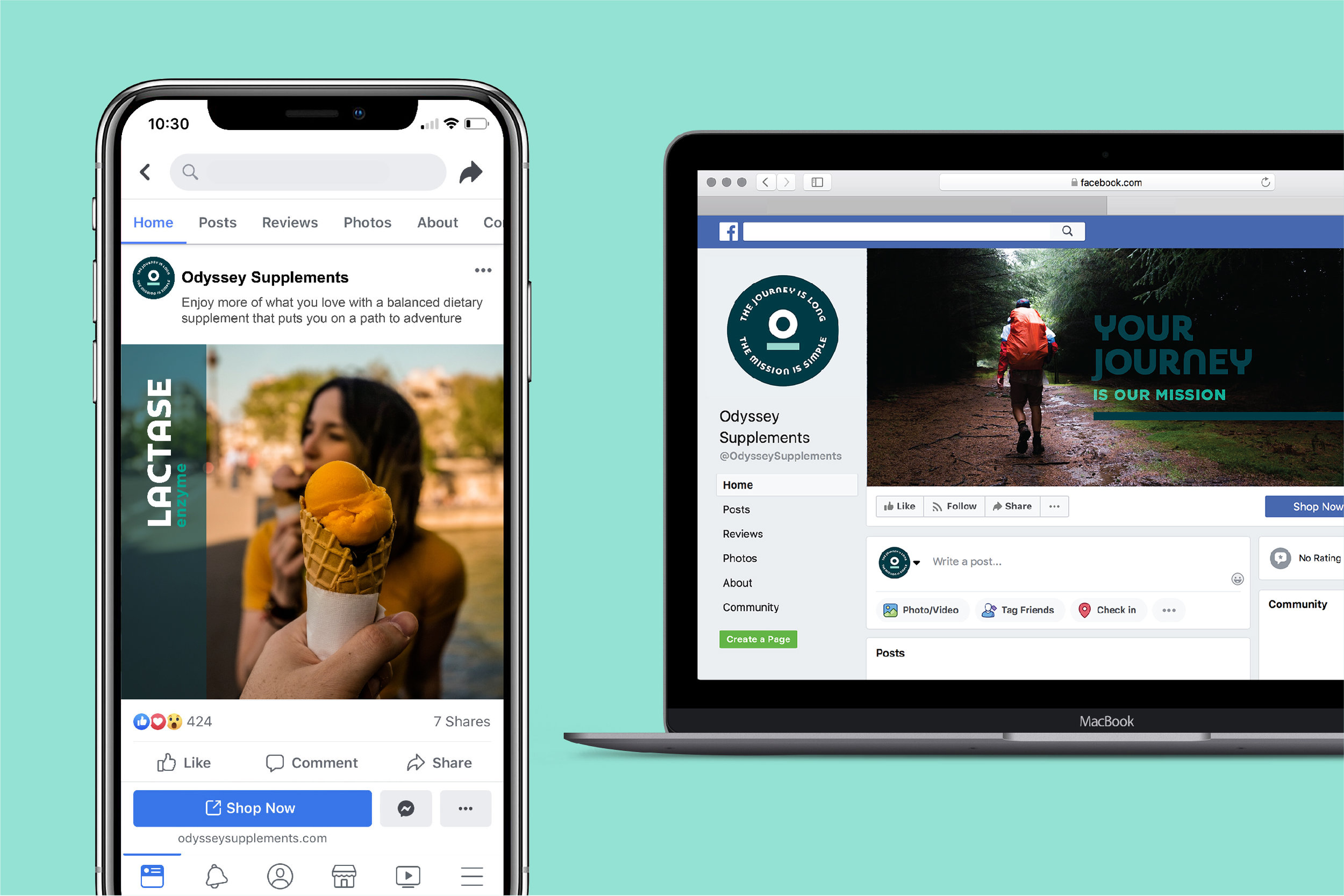
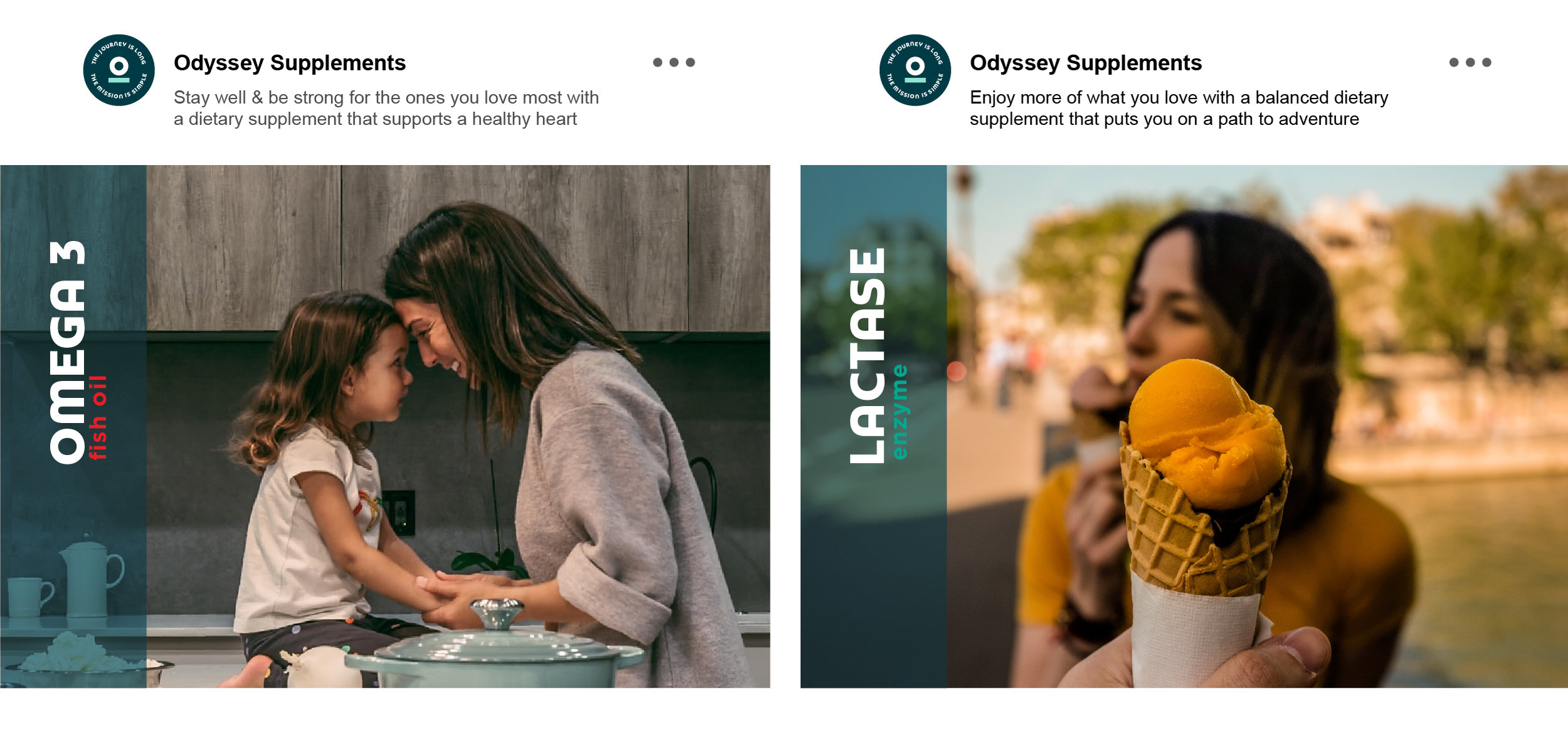
Digital applications illustrate the flexibility & adaptability of the Odyssey branding across print and digital touch points.
Strategy Development, Category Analysis, Brand Naming, Design, Illustration
Created while employed at BrandFirst Creative Agency. Rights to this design are owned by Ronkin Group. The artwork featured in this portfolio is for personal use only and is not intended to promote any product, brand, or service, or infringe on trademarks and copyrights.